
Services
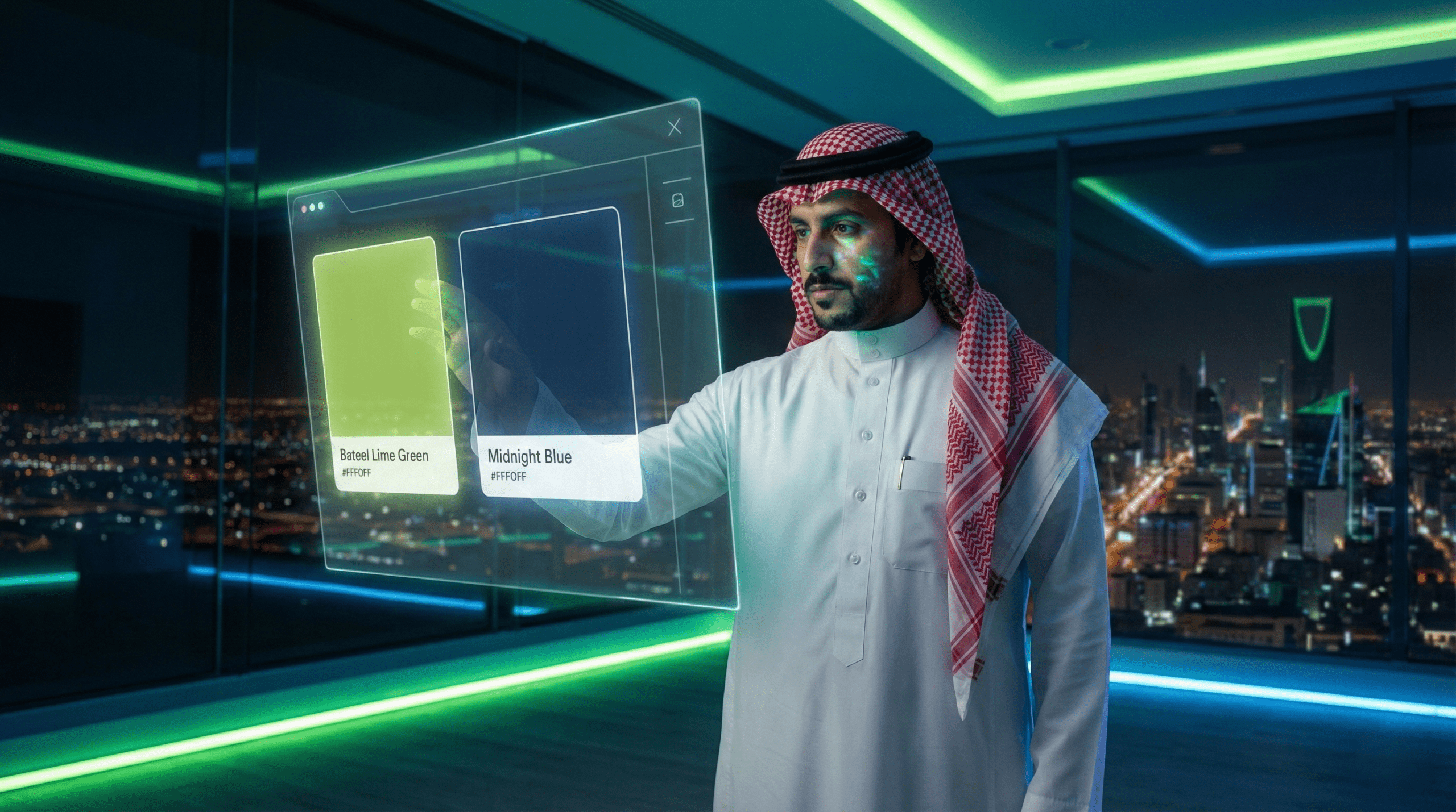
Have you ever felt visually irritated or lost your trust in a website because of its clashing colors or poor font? Don’t risk a similar effect on your brand. When you begin your journey of building your tech company or online store in the Saudi market, the first thing that catches the customer’s attention isn’t the price, but the visual impression.
The process of Choosing colors and fonts for the visual identity is not just an aesthetic preference or a matter of taste; it’s a deliberate strategic decision that directly affects perception and customer trust. Colors set the emotional tone your brand sends (such as trust or innovation), while fonts (especially Arabic fonts the modern, clear ones) ensure readability and professionalism. This deliberate, consistent blend is the secret to the “love of appeal” of strong brands that leave an indelible mark.
In this guide, you’ll clearly understand how to master the art of choosing colors and fonts for your company’s visual identity:
Studies indicate that the customer makes nearly 90% of their decisions based on color within the first seconds of interacting with the brand. The the impact of colors is so powerful that it shapes the customer’s impression before they read a single piece of content. So, the first step in choosing colors for the identity is understanding their psychological and cultural significance, especially in the Saudi market.
The color you choose must reflect the core value your company offers. Are you selling security? Are you selling innovation?
Color Meanings and Examples from Saudi Companies
| the color | Psychological meaning | Its context in technology | Example of a Saudi company that uses it |
| Blue | Trust, security, stability, intelligence | Best suited for SaaS and software solutions | stc (strong blue) |
| Green | Growth, development, health, quality | E-commerce platforms and startups | Jahez |
| Red/Orange | Excitement, energy, warning, passion | CTA buttons and prompting immediate action | Mrsool (orange for speed) |
| Black/Gray | Sophistication, professionalism, power | Luxury identities for major corporations | Aramco Technology |
At Bateel Tech, we turn these theories into reality through integrated visual identity building services that guarantee you instant distinction.
To ensure your brand’s appeal and avoid falling into the trap of “clashing colors”, you must rely on classic color theory:
The importance of color contrast (Color Contrast) is paramount; there must be sufficient contrast between the text color and the background color to ensure readability (Readability), especially in interface design tech apps and websites, so that the user feels visual comfort.
A Saudi example:
When applying color theory to the identity of an online store selling products with a local character (such as luxury date products), warm, sandy colors (shades of brown and dark orange) can be chosen as a secondary color, while a strong accent color (like emerald green) is used for the purchase buttons, achieving a balance between authenticity and professionalism.
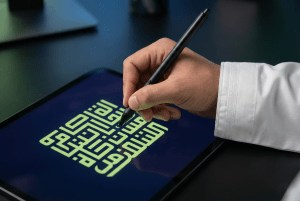
You can’t build a strong visual identity for Saudi companies without mastering the art of choosing fonts Arabic ones. The font is what gives content its voice and ensures your message is delivered with clarity and confidence.
Key points: Indeed, Arabic fonts The chosen fonts are the first thing to reflect your respect for the local Saudi identity. In the visual identity tech, the challenge is finding an Arabic font that pairs with a Latin font (in case your apps or websites are bilingual), while maintaining readability on modern screens.
Building a strong brand requires more than just a single font; you need a complete “font family” (Bold, Light, Regular, Semibold).
A Bullet List – 5 Qualities Your Chosen Fonts Must Have
Choosing the right colors is only the beginning; the real challenge lies in Visual consistency for the brand across all platforms.
Aesthetics have no value unless they translate into an excellent user experience. Applying colors and fonts in interface design your company is what determines your digital success.
Colors and fonts must serve usability, not the other way around. The Choosing colors and fonts for the correct choice reduces eye strain and guides the user toward taking the desired actions.
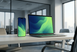
Achieving visual consistency is the key to the “love of appeal”. The customer must see your brand in the same form, with the same colors, and with the same fonts whether they’re browsing your website, watching a motion-graphics video, or seeing a paid ad on Twitter.
A Saudi example:
Imagine an SME marketing manager in Riyadh launching an ad campaign on Snapchat. She must make sure the fonts used in the paid ads are exactly the same as the fonts on the website, to avoid confusing the audience, to ensure instant brand recognition among competitors, and to ensure the ads achieve their goals.
Don’t settle for knowledge; turn your ambition into a distinctive visual reality. Request a Free Consultation Now to design your complete visual identity and ensure its appeal in the Saudi digital market.
It has become clear that Choosing colors and fonts for the is an investment in customer trust and a fundamental building block in building your brand:
Start today by designing a visual identity that makes your brand pulse with appeal and trust in the Saudi market and guarantees you visual superiority
The answer: yes, some cultural connotations differ. Green (which symbolizes growth globally) has strong religious and national connotations in Saudi Arabia, which further boosts trust and must be taken into account when choosing colors for a brand’s national character.
We use and recommend “modern geometric fonts” (Sans-Serif Arabic) such as Noto Sans Arabic, Tajawal, and Harmattan. These fonts are designed for digital interfaces and ensure the readability and professionalism required.
The answer: this is done through a “brand guidelines” document that sets fixed templates for image dimensions, the proportion of brand colors used, and the space allocated to the logo in each ad, to ensure your brand is recognized instantly.
The cost varies based on the level of complexity (a logo design only, or a complete identity including brand guidelines and interface design). To find out the exact, customized cost for your company, it’s best to request a free consultation from the Bateel Tech team.
