
Services
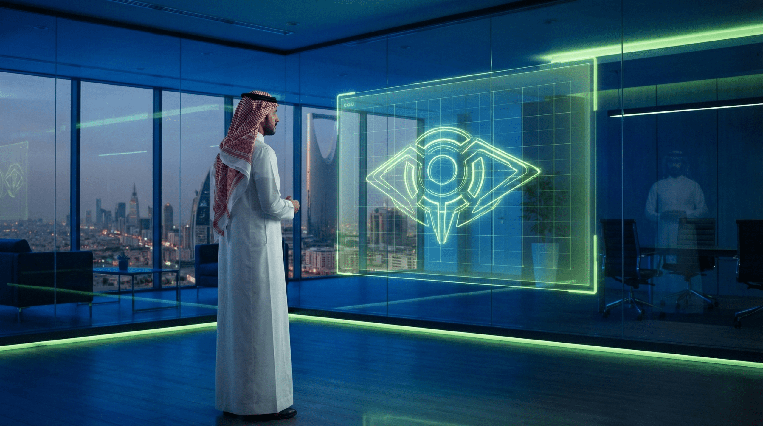
Do you realize how many successful tech brands (like Jahez or stc) you can recognize instantly just by seeing their logo or color? In a competitive, thriving tech market like the Kingdom of Saudi Arabia, do you risk letting your brand become dull and forgettable, thereby losing the advantage of distinction and the opportunity to grow?
Regarded as The visual identity of a tech company is the cornerstone on which trust and high credibility (E-E-A-T) are built. It isn't just a “logo design” or a set of pretty colors; it's an integrated visual language that tells a story of innovation and professionalism. This visual language includes all the elements, from choosing the brand colorpalette, to the shape and styles of Arabic fonts professional typography, all the way to the graphic elements that ensure complete visual consistency across every customer touchpoint.
The goal of building a tech company visual identity that is strong and clear is to convey a specific, compelling message to your audience: this company is innovative, trustworthy, distinguished, and deserves your attention. It's the first means of planting trust in the Saudi entrepreneur or marketing manager, and satisfying their “love of distinction” that the market demands.
In this comprehensive guide from Bateel Tech, you will learn:
Some view visual identity as a “cost”, but the truth is it's a “strategic investment” that raises the company's market value, especially in the tech sector, which by nature lacks a tangible physical product the customer can rely on.
In the world of apps and digital solutions, where trust is the most important currency, a strong a tech company visual identity acts as “insurance” against doubts. When a potential customer sees a carefully designed website and an app with consistent colors and fonts, they automatically translate that into reliability and quality in the product or service.
A real Saudi example:
Imagine a Saudi entrepreneur looking for a partner to implement AI solutions in their store. When they find two companies: the first with a shaky, inconsistent identity, and the other with an integrated, cohesive identity and a professional logo (a focus on authentic Arabic typography with a modern touch), they'll choose the second instantly. This strong visual identity is what turned the company from a mere name into a trusted entity.
Reasons Visual Identity Fails – 5 Points You Need to Avoid
To ensure the building of a tech company visual identities on sound foundations, you must avoid the following fatal mistakes:
Amid the fierce competition in the Saudi tech market, it's not enough for your product to be good; it must be visually distinctive. A strong visual identity allows the tech company to “the love of distinction” and stand out against massive competition, acting as a visual filter through which the customer selects the serious brands.
The logo is the core of a tech company visual identity, the point where all your concept and values converge. It's not just an image, but a visual shorthand for your entire story.
The tech sector calls for logos marked by intelligence and professionalism, and usually the following styles are the most common and successful:
| Logo Type | Description | Degree of Suitability for Tech Companies (AI/Odoo) |
| Wordmark / Logotype | A logo based on the company name alone in a distinctive font (such as Google, Canon). | High: Ideal for companies building their brand around their name. |
| Abstract Mark | An abstract logo that doesn't represent anything physical, but a concept (such as the Nike or Pepsi logo). | Very high: Ideal for companies innovating in AI or augmented reality to represent new ideas. |
| Emblem / Combination | Combining the text with the icon inside a frame (such as Starbucks). | Low: Often complex and not well-suited to the requirements of digital applications. |
Practical application: Setting 3 practical criteria for choosing the right logo type for a tech company visual identity:
In the digital age, the logo must be “responsive” (Responsive Logo), meaning it adapts to every screen size and platform without losing its identity. From a 16×16 pixel app icon to a full website interface.
Comparison Table – Traits of a Timeless Logo
| Trait | Description | Its Impact on a Tech Company's Visual Identity |
| Simplicity | Free of distracting details. | Easy to use as a favicon or app icon. |
| Distinction | The logo's uniqueness compared to competitors. | Reinforces visual distinction and the customer's “love of distinction”. |
| Timelessness | Its ability to stay modern 10 years from now. | Spares you the exorbitant costs of redesigning. |
| flexibility | Its good appearance across all sizes and platforms. | It ensures visual consistency complete consistency in digital marketing. |
The most common mistake is using tech “clichés” (such as the Wi-Fi icon, or circular icons that represent “globalness”, or the lightbulb icon). A Logo design must be more precise and symbolic. The focus here should be on the value, not the tool.
After the logo come colors and fonts to complete the visual language. They are the two pillars that guarantee you visual consistency at every step your company takes.
affects brand color the decisions of readers and users directly. The chosen colors must reflect your company's core values in the tech sector:
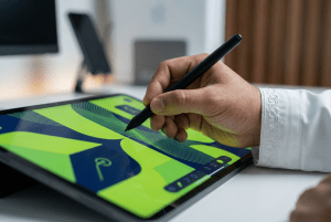
is not complete a tech company visual identity in the Saudi market without extreme attention to Arabic fonts. The Arabic language is the foundation of our identity, and choosing modern, clear fonts ensures the professionalism of your marketing materials.
Brand guidelines are your company's visual constitution. Without this document, you'll lose control over visual consistency over time as the team expands or you outsource motion graphics or ads design.
The core elements the guide must include:
The role of a tech company's visual identity doesn't stop at designing the logo; it extends to how the customer interacts with your digital products and services. This is the true test of your company's visual power.
The visual identity must be an integral part of the user experience (UX). For example, brand color aren't used randomly, but to guide the user's eye.
A practical Saudi example:
When designing e-commerce store solutions (whether WooCommerce or Shopify), at Bateel we ensure that integrating local payment gateway logos (such as mada and STC Pay) is done with the highest degree of visual harmony with the store's identity, without breaking the store's core colors or fonts, which strengthens trust for the Saudi shopper.
As Saudi tech companies increasingly use motion graphics and augmented reality (AR) to explain or advertise their products, maintaining visual consistency becomes a bigger challenge.
Performance ads are your company's face on social platforms. The importance of a unified template for designing social media ads can't be underestimated. This template must carry a fixed logo, unified fonts, and a consistent layout of brand color to ensure instant brand recognition even in the context of crowded platform ads.
Controlling your brand means fully committing to the standards; learn the importance of Brand Visual Consistency: The Secret to Building Trust to ensure your identity doesn't fade as you expand
Don't let your brand get lost in the crowd and become dull and forgettable. Book your free consultation now to design a strong visual identity for your tech company and ensure its visual superiority in the market, and start your journey of distinction with us.
It has been proven that investing in a tech company visual identity is an investment in the future and in credibility.
Invest smartly in a visual identity that speaks of your commitment to professionalism and innovation, and stand out in a market that's waiting for you to lead and excel
Q1: How long does it take to build an integrated tech company visual identity?
The answer: the duration depends on the complexity and the depth of the guide required. But it usually ranges between 4 and 8 weeks, starting with market and competitor analysis and ending with delivering the complete brand guideline and the logo and fonts ready for use.
Q2: What is the fundamental difference between Visual Identity and Brand?
The answer: the brand is the broader concept that encompasses the values, message, tone of voice, and the personality the company speaks with. The visual identity is the visible, tangible part of the brand (the logo, brand colors, patterns, fonts).
Q3: Should classical Arabic fonts always be used in the visual identity of Saudi tech companies?
The answer: not necessarily; rather, blending authenticity with modernity is recommended. We use modern, geometric fonts that ensure readability and modernity, while being careful to retain the strong cultural identity of the Saudi market.
Q4: How does visual consistency affect website performance in search engines (SEO)?
The answer: visual consistency greatly enhances the user experience (UX). Improving UX reduces the bounce rate and increases dwell time, both of which are highly positive factors that search engines (SEO) rely on to raise your site's ranking.
