
Services
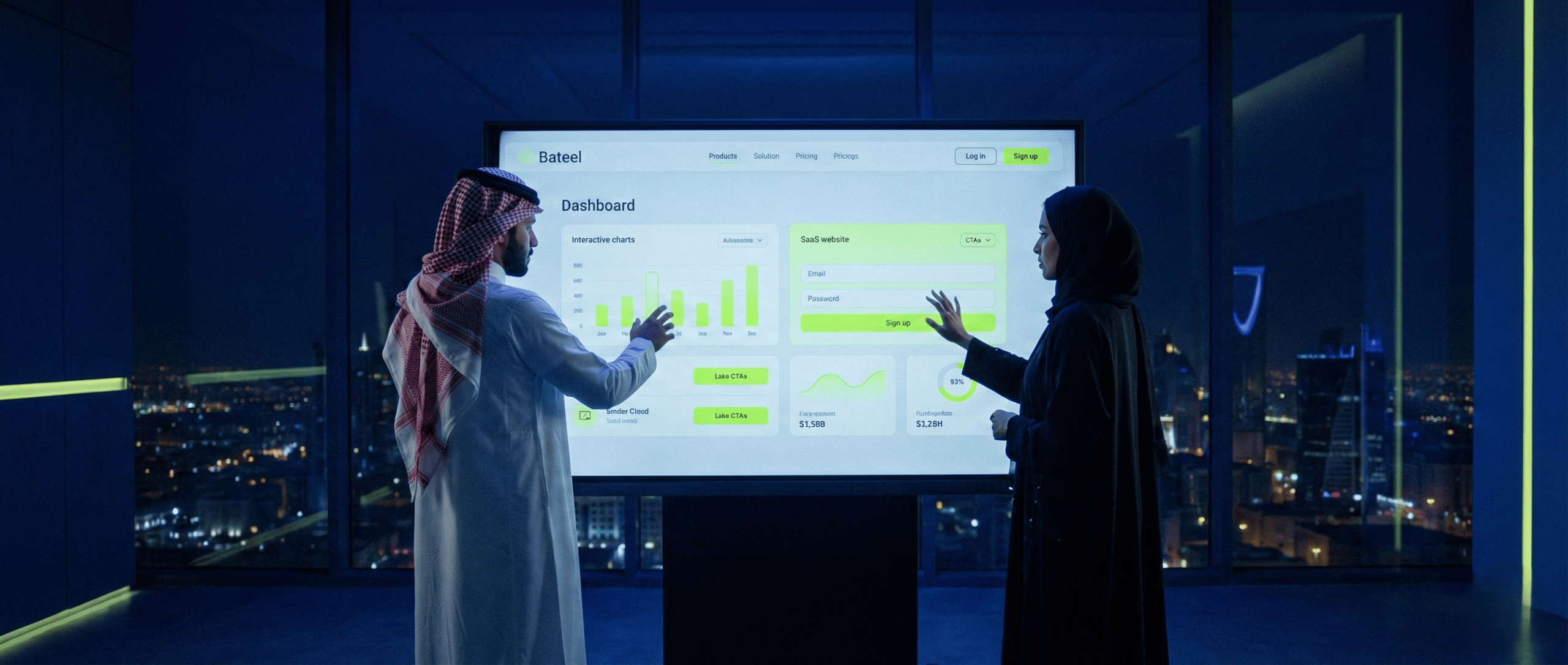
The shocking truth is that 80% of tech companies lose potential customers on the very first visit, and the reason? An outdated website design that doesn't reflect their actual professionalism and doesn't build enough trust in a market that values speed and reliability like the Saudi market.
You must realize that designing a tech company website is not just a display of your services and products; it is the silent salesperson working on your behalf around the clock, seven days a week. A professional website designed with a professional customer experience in mind is the only guarantee for increasing conversions and building unshakeable trust. It is your first and most important digital investment for 2025.
What the reader will learn:
The customer in the Saudi market, especially the B2B customer, is highly sensitive to appearance. If your website looks like it was designed a decade ago, you send an immediate message that your company doesn't keep pace with rapid technological developments, and that's a fatal contradiction for a tech company!
When a potential customer visits your website, they aren't looking for a long list of features; they're looking for solutions to their pain points and for evidence that you are trustworthy. A designing a tech company website modern, clean one reflects financial stability and technical expertise. This design reassures the customer that you're capable of investing in your digital interface, and therefore capable of investing in their success.
A Saudi example: Saudi customers see clarity and credibility as vital. If a customer sees that the site loads fast, shows reputable local partners, and has clear contact channels, they start building credibility even before reading the first word of the service description.
E-E-A-T (Experience, Expertise, Authoritativeness, Trustworthiness) is the cornerstone of modern SEO, and it's even more important for tech companies. How does your website prove your expertise?
A common mistake tech companies make is overfocusing on complex jargon (such as “Full Stack Development” or “Blockchain Integration”) instead of the benefits the customer will gain.
The conversion formula: Focus on benefits (Benefit-driven) instead of features (Feature-driven).
| Feature focus (weak) | Benefit focus (strong and converting) |
| “We use the latest React Native technologies to develop apps” | “We launch your app in just 4 weeks with a guaranteed 99.9% performance on iOS and Android” |
| “We have an integrated Odoo ERP system for resource management” | “Discover how the Odoo system doubles your profits by automating 70% of your administrative tasks” |
Don't start designing buttons and colors before you know who you're addressing and what they want. Strategic planning is 80% of the success of any designing a tech company website.
Who is the person who makes the purchase decision at the company you're targeting?
The key points to define before starting the design:
The information architecture is the map of your website. If the map is complex, the customer gets lost and leaves. The structure must be logical and simple to ensure the customer doesn't lose their way, and this is an essential part of a professional customer experience.
The Two-Click Rule: The main service your tech company sells (such as “custom app development”) should be just “two clicks” away from the homepage. If reaching the service requires more than three clicks, you're complicating the customer's journey and lowering the likelihood of conversion.
The content should be a balanced mix.
Conversion isn't limited to content; it starts with the feeling your interface conveys. UI/UX are the face that determines whether you're a startup or a tech giant.
user interface design a successful one for tech companies relies on:
a professional customer experience is the feeling the user gets while interacting with your website. The biggest challenge for tech companies is ultra-fast speed. The website must be ultra-fast to reflect the efficiency of your tech company itself. A company that sells technical solutions can't have a slow website.
Essential UX points:
In the Kingdom of Saudi Arabia, the rate of browsing via smartphones exceeds 70% in most sectors. This means your website launches on the phone first, not the computer.
Practical application: Your website must be fully responsive, prioritizing the interface compatible with small screens. Make sure the CTA and main buttons are easy to tap with a thumb.

No matter how designing a tech company website beautiful it is, it fails if it doesn't convert visitors into customers. This section focuses on the engineering of persuasion.
The CTA (Call To Action) is not just a button. It's the offer the customer can't resist. The effective CTA must be benefit-oriented, focused on the benefit the customer will get, not just a command you're issuing:
| Weak CTA (action-oriented) | Strong CTA (benefit-oriented) |
| “Submit your request now” | “Request your free consultation to grow your business” |
| “Contact us” | “Book your free session to evaluate your current website” |
| “Read more” | “Start achieving higher profits: download our free guide” |
The psychological requirement: The CTA must remove the barrier of fear and commitment. Phrases like “free,” “evaluation,” and “for a limited time” encourage clicking.
Landing Pages are the secret engine of improve conversions. They must adhere to the principle of: “One page, one goal”.
Where do you place the effective CTA? The strategic positions are:
Practical application (A/B Testing): Don't assume your first version is the best. You should always test two different versions of the CTA (with different colors and phrases) to find out which achieves improve conversions the better one.
To achieve full E-E-A-T, your designing a tech company website website's professionalism must reflect your commitment to the local environment and Saudi regulations.
Even if your website isn't an online store, displaying the logos of locally trusted payment gateways (such as mada, STC Pay, Apple Pay) in the partners section or at the bottom of the page boosts trust and credibility with the Saudi customer. It sends an immediate message that you're a company operating according to local standards.
The primary currency displayed in any quotes or packages should also be the Saudi Riyal (SR) to avoid any confusion.
Legal reliability is no less important than technical reliability. Your designing Saudi tech company websites website must provide clear pages for these elements:
The Saudi Ministry of Commerce website
A website's speed depends heavily on where it's hosted. To achieve an a professional customer experience ideal one in Saudi Arabia, it's preferable to rely on:
Good design needs powerful tools. Discover the best UX/UI tools for Saudi online stores that we use to ensure an unforgettable user experience in our next article.”
We've come a long way in understanding that a designing a tech company website professional one is a complex process that requires strategic planning, creativity in user interface design and landing pages, and deep expertise in improve conversions through effective CTA, all within the framework of Saudi standards.
But all these steps require specialized expertise and precise, constantly updated knowledge of the Saudi market. An entrepreneur can't do all of this alone without a technical partner who guarantees real results and links the design to actual conversions.
At Bateel Tech, we're not just a design company. We are one integrated team of UI/UX designers, conversion analysts (CRO), SEO experts, andOdoo developers. We work with you from crafting the technical message all the way to fully launching the site, securing it, and preparing it for improve conversions.
After learning the steps to design a professional tech company website, try our free consultation so we can plan a website for you that sells from day one.
In conclusion, remember that your digital interface is a direct reflection of your reliability and capabilities.
Don't postpone the decision to design the digital interface your tech company deserves. The future of your business starts with the customer's first click.
The most important features are ultra-fast speed, the clarity of the effective CTA (with benefit-oriented wording), easy navigation that achieves a professional customer experience, and integrating trusted social proof backed by real company logos.
A designing a tech company website comprehensive professional one ranges between 4 and 8 weeks, depending on the complexity of the information architecture and the requirements of user interface design custom ones. Bateel Tech takes responsibility for the full launch within this period.
An ordinary page is multi-purpose and lets the customer navigate the site, whereas a landing page (Landing Page) has only one goal (such as a download or requesting a quote) and is designed specifically to effective CTA and to increase improve conversions through the principle of focus.
Yes, Bateel Tech specializes in designing Saudi tech company websites, taking into account E-E-A-T requirements and integration with Odoo and AI solutions to ensure the website is not just a display interface, but an integrated sales engine.
To understand your customer more deeply, you need to map their journey. Read our guide on the customer journey map from visit to purchase to build a seamless experience.”
